Cartography is a powerful comprehension and decision support tool. But certain rules need to be followed to produce useful and effective maps. Are you sure that you know and master these rules?
Digital cartography has become widespread in the business world and its uses have become ever more diverse. Maps are therefore frequently used for:
- Analyzing and presenting activity outcomes
- Pinpointing customers, assets, resources, competitors…
- Assigning balanced territories/portfolios to technicians or the salesforce
- Determining a territory’s sales potential based on its socio-demographic characteristics.
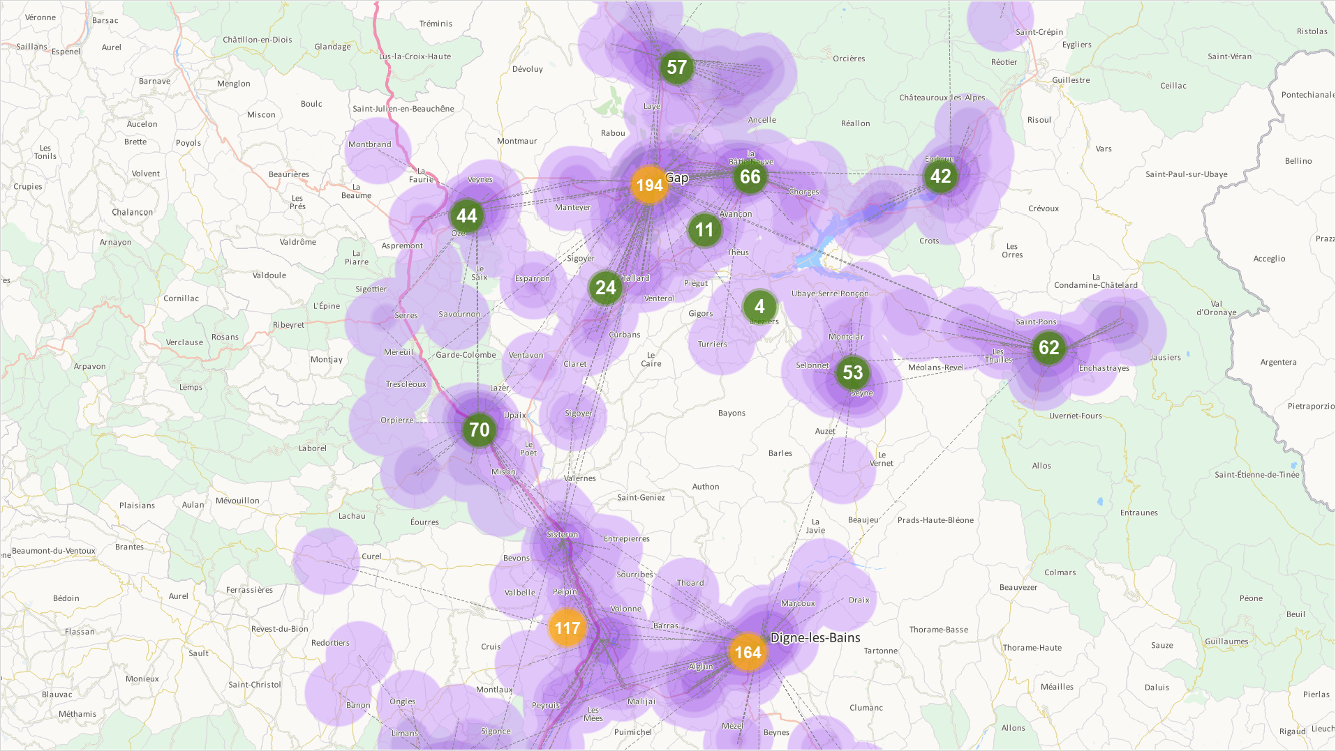
- Representing goods flows and the movement of people
- Defining catchment areas, areas of influence
- Using multiple criteria to compare site location areas
- …
Whereas cartographic software products make it considerably easier to generate and disseminate maps of all kinds, they do not inherently guarantee the quality of the maps produced. Even worse, the multiple modes of representation and graphical options these tools provide may result in non-specialists creating maps that are not relevant, or simply wrong! A serious problem for the documents that are supposed to support analyses and inform decision-making…
This is how to avoid the main pitfalls and help you produce maps that truly serve your objectives.
The fundamental characteristics of a good map
A good thematic map is above all a map that delivers an immediate message, because the chosen mode of representation is tailored to the subject in question and is based on graphical conventions (symbols, colors) that the brain immediately understands. These conventions are not a fluke. They are a visual language, the principles, rules, and limitations of which all result from the physiological requirements of the human eye.
Consequently, to be of good quality, a map must be:
- clear and make a particular item of information obvious/striking/prominent – typically, differences, imbalances, correlations, or a hierarchy which would be far more difficult to detect and understand in data series;
- accurate, precise and reliable, these adjectives referring to the relevance of the graphical choices, to their appropriateness to the level of information that the author wishes to communicate, but also to the quality of the data used, and the rigor of the processing these data underwent;
- easy on the eye, a less subjective criterion than one might imagine since the author’s aesthetic choices are necessarily bounded, on the one hand, by the requirement for clarity and, on the other hand, by adherence to the fundamental rules of graphical semiotics.
Upfront questions that avoid many an error
The current great ease in creating maps often results in non-specialists producing:
- useless maps, namely conveying no message, or providing less information than the data tables from which they are derived. In certain cases (limited or very homogeneous data series, weak or insignificant geographical link…), a histogram is more appropriate than a map.
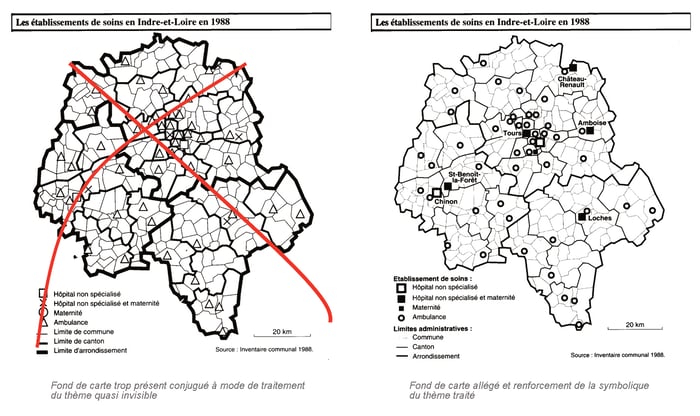
- cluttered maps, for want of selectivity in terms of the phenomena and objects displayed. This category includes the category of “overly wordy” maps where there is more to read than there is to see. An effective thematic map must be selective and more visual than textual.
- maps conveying a message contradicted by the data, for want of mastery of the display conventions or processing performed on the source data. If the author does not differentiate between the mean and median, he can in all good faith produce a map that he will think accurate whereas it will be fundamentally erroneous.
To avoid falling into these pitfalls, do not charge willy-nilly into your software’s features. Start by thinking, and attempting to answer the following questions:
- What is the main message I wish to convey through this map?
- Who is the audience?
- What is the relevant data for what I want to demonstrate? Are they available? Are they of good quality? Are the series complete? Which ones am I selecting and why?
- How should these data be processed, and how do I create an information hierarchy to make my map more impactful?
You have no idea how much time this reflection and clarification process can save you during the next step, namely the construction per se of your map – not to mention the quality of the outcome!
5 pieces of advice for effective thematic maps
1 – Choose an appropriate map background for your subject. There is no point burdening yourself with municipal boundaries if all the data you intend to use are departmental. The map background is an indispensable medium, but it needs to be discreet to avoid impeding the interpretation of the important features of the map. For this reason, opt for a thin line when delineating administrative entities, in mid-grey rather than black.
2 – Work at the right scale – You can zoom on the screen of course. It is practical, but it is also deceptive, especially if your maps are intended to be printed. The details you have refined, municipality by municipality, by zooming in as much as you can on the screen on a national map have every chance of being illegible once the map is printed in A4 format.
3 – Eliminate superfluous or “off topic” information levels – Cartographic databases enable you to display surface entities, roads or even the waterway network separately. Is it really necessary to display the latter if you want to map the turnover of one of your product categories by municipality or by department?
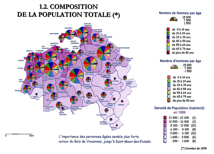
4 – Do not use multiple forms of graphical expression – In order to present the maximum amount of information on one and the same map, it may be tempting to use color gradations for one data series, colored rasters (hatching, dots) for a second, proportional symbols for other series and, finally, histograms or pie charts. Your, theoretically very rich, map will simply be “pointlessly complicated” not to say completely unreadable.
If all the information you want to present is really important, it is often more appropriate to make several complementary maps.
5 – Do not forget the rendering components – A thematic map invariably comprises:
- A title clearly stating the theme being studied, the study area and the date/period of study. For example: “Development in store headcount, France – 2012-2020” or “Agency headcount, France and Germany – 2012”;
- A legend explaining ALL the graphical elements (meaning of each symbol, each color, symbol scale, ...). It is not an option! Without a legend, or with an incomplete legend, your map risks not being understood, or being misinterpreted. Remember that your legend as well has to be easy to read, and leave no scope for interpretation;
- The sources used, dated if possible;
- The author’s name.
Even in thematic cartography, the scale indication is not optional. On the other hand, you do not have to indicate North, unless you deliberately choose to break with convention by putting North at the bottom!
Statistical processing is not neutral!
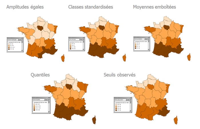
Mapping a statistical data item is synonymous with discretization, a process consisting in converting a raw statistical series into an ordered series divided into classes. For your map to be impactful, discretization must retain the order of magnitude, abide by the shape of the distribution, and maximize heterogeneity between classes. There are many discretization techniques/methods (based on the mean, the median, standard deviation, quantiles, median deviations…). The following methods are among the most commonly used in cartography:
- The equal-amplitude method, to be used when the distribution of the processed data item is uniformly distributed between the minimum and maximum;
- The quantiles method, consisting in creating classes of almost equal size.
- The observed breaks method, akin to the Jenks (“natural breaks”) method, consists in minimizing the intra-class interval and maximizing the inter-class interval;
- The standard deviation method, used for bell curve, Gaussian, distributions.
For one and the same data series (number of dentists per 100,000 inhabitants in 1990, in the example below) you can obtain very different classes, and therefore maps, depending on the chosen discretization method.

Irrespective of the method chosen to suit your purpose, bear in mind that beyond 7 classes, your map becomes very difficult to read, even with an astute choice of colors. The only solution is to rework your data division to have between 4 and 7 classes.
Color yes, but not any old how!
All cartographic software enables you to apply a color variable to surface components, and size and color variables to the linear and point components comprising your map. But beware: not everything that is technically feasible is desirable!
For surfaces, when should you use a color gradient or proportional symbols? The answer is simple: when dealing with relative statistical data, a ratio, a percentage, use a color gradient on the surfaces of the territory in question, and use a series of proportional symbols for weight data, raw quantities.
Representing statistical classes using colors follows rules which bear recalling:
- the class corresponding to the highest values is the darkest hue;
- positive value classes generally use hot colors (red, orange, yellow and their derivatives) negative value classes are in cold colors (mainly blues);
- an order or classification is expressed by a color and value gradation in the form of shading or a color sequence (in the order in which they appear in the rainbow). Note that in cartography, white is reserved for areas for which you have no data. Do not use it for the lowest values in your distribution.
A good test for knowing if your color scales are distinguishable and readable: flip your map to a grey scale and spot nuances that are too close to one another and rework them.
There are millions more things to say about the art and techniques for creating good maps. By following these few pointers, not only will you avoid schoolboy errors, but you will also make better use of your cartographic tool’s capabilities – to express exactly what you want and to reveal what your data contains.


